
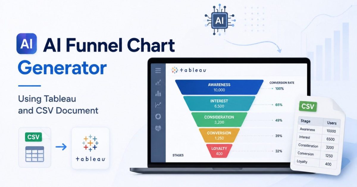
Building a funnel chart from a CSV sounds simple until the data gets messy. Funnel stages may be out of order, the same user may appear multiple times, and incorrect aggregation can make conversion and drop-off rates misleading. Creating and updating the visualization manually also becomes repetitive as new data arrives.
An AI funnel chart generator using Tableau and CSV document data can simplify this workflow. AI can help clean and interpret the CSV, identify likely funnel stages, detect anomalies, and surface drop-off patterns, while Tableau provides the interactive visualization layer. For more advanced workflows, Python models can also be connected to Tableau through TabPy for predictive analysis. Tableau officially supports TabPy for executing Python scripts and saved functions within analytics workflows.
This guide explains how the workflow works, how to structure your CSV, how to build the funnel in Tableau, where AI actually adds value, and how to avoid inaccurate funnel analysis.
What Is an AI Funnel Chart Generator?
An AI funnel chart generator is a workflow that uses artificial intelligence to help turn structured data into a funnel visualization and analyze how users or items move through sequential stages.
A typical funnel might look like:
Website Visit → Product View → Add to Cart → Checkout → Purchase
A traditional funnel chart shows how many users reach each stage. An AI-enhanced workflow can go further by helping you:
- identify and order funnel stages;
- clean inconsistent CSV data;
- calculate conversion and drop-off rates;
- detect unusual changes or bottlenecks;
- segment performance by campaign, device, cohort, or customer type;
- predict potential drop-offs when a suitable model and sufficient historical data are available.
The important distinction is that Tableau does not need a single feature called “AI Funnel Chart Generator.” You can build the workflow by combining CSV data, Tableau visualizations, calculated fields, Tableau’s analytics capabilities, and optionally external AI or machine-learning models.
How the Tableau + CSV + AI Workflow Works
The basic process is straightforward:
CSV data → Data preparation → Funnel-stage mapping → Tableau visualization → AI analysis → Validation → Business insight
Tableau handles the visualization and interactive analysis. AI is most useful before and after that step: preparing the underlying data, recognizing patterns, explaining anomalies, or applying predictive models.
For example, imagine an e-commerce CSV showing:
| User ID | Event | Stage | Device |
|---|---|---|---|
| U001 | Website Visit | 1 | Mobile |
| U001 | Product View | 2 | Mobile |
| U001 | Add to Cart | 3 | Mobile |
| U002 | Website Visit | 1 | Desktop |
| U002 | Product View | 2 | Desktop |
From this data, you can calculate how many unique users reached each stage and visualize the decline in Tableau.
AI could then help investigate questions such as:
Why is mobile checkout conversion lower than desktop?
That’s where the workflow becomes more useful than simply generating a funnel-shaped chart.
Prepare Your CSV for Funnel Analysis
Good funnel analysis starts with good data. AI cannot rescue a fundamentally incorrect event structure.
For user-level funnel analysis, a useful CSV typically includes:
- User or Session ID: identifies each person or session;
- Event/Stage: describes what happened;
- Stage Order: establishes the correct funnel sequence;
- Timestamp: shows when the event occurred;
- Cohort/Campaign: enables segmentation;
- Device or Channel: helps explain behavioral differences.
A simple structure could be:
User_ID,Timestamp,Event_Name,Stage_Order,DeviceU001,2026-08-01 10:00,Visit,1,MobileU001,2026-08-01 10:03,Product_View,2,MobileU001,2026-08-01 10:06,Add_to_Cart,3,MobileU001,2026-08-01 10:10,Purchase,4,Mobile
Before importing the file, check for duplicate events, missing IDs, inconsistent stage names, incorrect timestamps, and invalid stage ordering.
One particularly important decision is whether to use COUNT or COUNT DISTINCT. If you’re measuring people progressing through a funnel, counting unique users is often more meaningful than counting events because one person may trigger the same event several times.
How to Create the Funnel Chart in Tableau
Once the CSV is ready, the Tableau side is relatively simple.
Step 1: Connect the CSV
Open Tableau and connect to your CSV file.
Confirm that:
- Stage Name is treated as a dimension;
- Stage Order is numeric;
- user IDs are interpreted correctly;
- timestamps use the appropriate date/time type.
Then sort the stages using Stage Order so the funnel follows the actual customer journey.
Step 2: Calculate Users at Each Stage
For a user-based funnel, calculate the distinct number of users reaching each stage.
You might end up with:
| Stage | Users | Conversion from Previous Stage |
|---|---|---|
| Visit | 10,000 | 100% |
| Product View | 7,200 | 72% |
| Add to Cart | 3,800 | 52.8% |
| Checkout | 2,500 | 65.8% |
| Purchase | 1,900 | 76% |
Now you can immediately see where the largest losses occur.
Step 3: Build the Funnel
A simple descending bar chart is often enough for analysis because the purpose is to compare stage volumes, not merely reproduce the physical shape of a funnel.
If you want the traditional centered funnel appearance, you can create a negative version of your stage measure and mirror it around the center.
For example:
Negative Users = -COUNTD([User_ID])
Use the positive and negative measures on opposite sides and format the view to create a symmetrical funnel.
Alternatively, Tableau’s extension ecosystem includes funnel-chart extensions that accept a stage dimension and measure and can display stage-to-stage conversion information.
Where AI Actually Adds Value
This is where many guides overcomplicate the topic.
You do not need machine learning simply to draw a funnel chart. Tableau can visualize stage counts perfectly well without it.
AI becomes useful when you want to reduce manual analysis or discover patterns that aren’t obvious from the visualization.
1. CSV Cleaning and Stage Detection
AI can help standardize inconsistent labels such as:
Add Cart, Added_to_Cart, and Cart Add
into one funnel stage.
It can also suggest stage ordering based on event names and timestamps.
However, you should validate these suggestions against the actual business process. An AI model doesn’t automatically know whether your organization’s “Qualified” stage occurs before or after “Demo.”
2. Drop-Off and Anomaly Detection
Once the funnel is built, AI can identify unusually large changes.
Suppose overall checkout conversion falls from 68% to 51%. Instead of manually checking every segment, analysis can look for differences across:
- mobile vs. desktop;
- marketing campaigns;
- geographic regions;
- new vs. returning users;
- customer cohorts.
The useful output isn’t simply:
“Checkout conversion declined.”
It’s closer to:
“Most of the decline is concentrated among mobile users from Campaign B.”
That gives analysts somewhere useful to investigate.
3. Predictive Drop-Off Analysis
If you have enough historical user-level data, machine-learning models can estimate the probability that a user or cohort will fail to reach the next stage.
This is where TabPy becomes useful.
TabPy allows Tableau to execute Python code and saved functions, making it possible to bring predictive models into Tableau calculations. Tableau specifically identifies data cleaning and predictive algorithms as TabPy use cases.
The important point is to train and validate the model properly. A predictive score based on poor data is not automatically valuable because it appears inside Tableau.
4. AI-Generated Explanations
AI can also turn funnel metrics into concise narrative summaries.
For example:
Purchase conversion fell 11% this week, with the largest decline occurring between checkout and payment among mobile users.
An LLM can help summarize the metrics, but the underlying numbers should come from your validated data—not from the language model itself.
This same principle applies more broadly to AI-generated analysis. Our Manus report analysis modes comparison explains how AI agents can work with files and produce reports, spreadsheets, and dashboards from supplied data.
Using TabPy for More Advanced AI Analysis
You don’t need TabPy for a basic funnel, but it becomes valuable when Python needs to participate in the analysis.
A common architecture is:
CSV → Tableau → TabPy/Python model → prediction → Tableau dashboard
TabPy can execute Python scripts remotely and return results to Tableau, while Tableau’s Analytics Extensions API can send data to external analytical services and receive transformed or scored results.
This can support:
- conversion probability scoring;
- anomaly detection;
- customer segmentation;
- forecasting;
- statistical analysis;
- pre-trained machine-learning models.
For production dashboards, it is often better to train models separately and use Tableau for scoring or visualization rather than repeatedly training a model every time someone interacts with the dashboard.
That keeps the experience faster and makes the model easier to validate and manage.
Calculate the Metrics That Actually Matter
A funnel becomes useful when it answers more than “How many people reached each stage?”
Track at least three metrics.
Stage conversion rate
Users at Current Stage / Users at Previous Stage × 100
Overall conversion rate
Users at Final Stage / Users at First Stage × 100
Stage drop-off rate
1 - Stage Conversion Rate
You can then segment those metrics by channel, device, campaign, cohort, location, product, or time period.
This often produces more actionable insights than adding increasingly sophisticated AI.
Common Mistakes to Avoid
The most serious mistake is incorrect funnel logic. A user appearing at Stage 4 does not always prove they completed Stages 1–3 unless your tracking system guarantees sequential progression.
Duplicate events are another common problem. Counting events rather than unique users can dramatically inflate stage volumes.
You should also avoid allowing AI to define funnel stages without human validation. AI can infer likely relationships from column names and event sequences, but the business ultimately defines what constitutes a valid conversion journey.
Finally, don’t over-engineer the visualization. If a standard descending bar chart communicates conversion more clearly than a decorative funnel, use the bar chart. The objective is finding where and why conversion is being lost, not creating the most elaborate dashboard.
Where AI Funnel Charts Are Most Useful
The same workflow applies to many sequential business processes.
- E-commerce:
Visit → Product View → Add to Cart → Checkout → Purchase - SaaS:
Visitor → Signup → Activation → Trial → Paid Customer - Sales:
Lead → Qualified → Demo → Proposal → Closed Won - Recruitment:
Applicant → Screen → Interview → Final Interview → Offer - Product onboarding:
Signup → Profile Setup → First Action → Activation → Retained User
The CSV structure changes, but the analytical question remains the same:
Where are people dropping out, and what explains the loss?
Final Thoughts
An AI funnel chart generator using Tableau and CSV document data is most useful when AI improves the analysis rather than simply automating the shape of the chart.
Start with a clean CSV and clearly defined sequential stages. Use Tableau to calculate and visualize conversion and drop-off rates. Then introduce AI where it adds measurable value: cleaning data, detecting anomalies, explaining patterns, segmenting users, or predicting future drop-offs.
For advanced implementations, Tableau’s support for Python through TabPy and its Analytics Extensions architecture makes it possible to connect predictive models directly with interactive analytics.
The goal isn’t to replace the analyst. It’s to reduce repetitive work and help the analyst reach the important question faster:
Why are users dropping off, and what should we change?
Frequently Asked Questions
1. What is an AI funnel chart generator using Tableau and CSV?
It is a workflow that combines CSV funnel data, Tableau visualization, and optional AI or machine-learning analysis to identify funnel stages, calculate conversions, detect drop-offs, and surface patterns in user journeys.
2. Can Tableau create a funnel chart from a CSV file?
Yes. Tableau can connect to CSV data and visualize stage-level measures. You can use descending bars, mirrored calculated fields, or compatible visualization extensions depending on the funnel design you need.
3. Do I need AI to create a funnel chart in Tableau?
No. AI is not required to create the visualization. It becomes useful for tasks such as data cleaning, stage detection, anomaly analysis, predictive modeling, and automated explanations.
4. What CSV columns are needed for funnel analysis?
At minimum, you generally need a stage and measure. For more detailed user-level analysis, include a user/session ID, event name, stage order, timestamp, and relevant segmentation fields such as campaign or device.
5. What is TabPy used for in Tableau?
TabPy connects Python with Tableau so Python scripts and saved functions can participate in Tableau analytics. It can be used for data cleaning, statistical analysis, machine-learning scoring, and predictive models.
6. Should I use COUNT or COUNT DISTINCT for a funnel?
Use COUNT DISTINCT when the funnel represents unique users and one user may generate multiple events at the same stage. Use COUNT when each row genuinely represents the unit you intend to measure.
